
If your velocity metric is "story points completed," you're measuring estimates,
not output. The truth about how fast your team ships lives in your deployment
data and code review patterns. Here are the four metrics that actually predict
shipping pace.
Why story points fail
Story points are a planning tool, not a measurement tool. They measure what the
team expected to complete, not what actually shipped. A team can have
"high velocity" (lots of story points completed) while deployments are down,
PRs are stalling, and code isn't reaching production.
The four metrics below measure actual engineering output, not estimates.
Metric 1: Deployment frequency
What it measures: How often code reaches production (or staging,
if you deploy to staging before prod).
Why it matters: Teams that deploy frequently are teams that
ship. Deployment frequency is the most direct measure of shipping pace.
Benchmarks:
- Elite: Multiple times per day
- High: Once per day to once per week
- Medium: Once per week to once per month
- Low: Less than once per month
How to measure: Count unique deployments to production per week.
Most CI/CD platforms (GitHub Actions, Vercel, CircleCI) expose this via API.
Metric 2: PR cycle time
What it measures: Time from PR opened to PR merged.
Why it matters: Long PR cycle times indicate bottlenecks in code
review, excessive rework from late feedback, or just general stagnation.
This metric is the single best predictor of delivery speed.
Benchmarks:
- Elite: Under 4 hours
- High: 4-24 hours
- Medium: 24-48 hours
- Low: Over 48 hours
How to measure: Pull data from GitHub's PR API. Calculate
average cycle time across all PRs in a given period.
Metric 3: PR review time
What it measures: Time from PR opened to first review comment.
Why it matters: This is the "time to first response" for code.
If it takes 24 hours to get a first review, the author loses context and the
whole process stretches. This metric catches bottlenecks before they compound.
Benchmarks:
- Elite: Under 1 hour
- High: 1-4 hours
- Medium: 4-24 hours
- Low: Over 24 hours
How to measure: Use GitHub's PR events API. Calculate time
between
pull_request opened and first pull_request_review event.Metric 4: CI pass rate on main
What it measures: Percentage of CI runs on main branch that
pass on first attempt.
Why it matters: Low CI pass rate means engineers spend time
re-running tests, investigating failures, and waiting for green builds.
This eats into the time available for new work.
Benchmarks:
- Elite: 95%+ pass rate
- High: 85-95% pass rate
- Medium: 70-85% pass rate
- Low: Under 70% pass rate
How to measure: Query your CI provider's API for workflow runs
on the main branch. Calculate pass rate (not total runs, but first-attempt passes).
Putting it together
These four metrics form a complete picture of engineering velocity:
- Deployment frequency: Are you shipping?
- PR cycle time: How fast is code moving through review?
- PR review time: How fast is code getting first feedback?
- CI pass rate: Is your pipeline healthy?
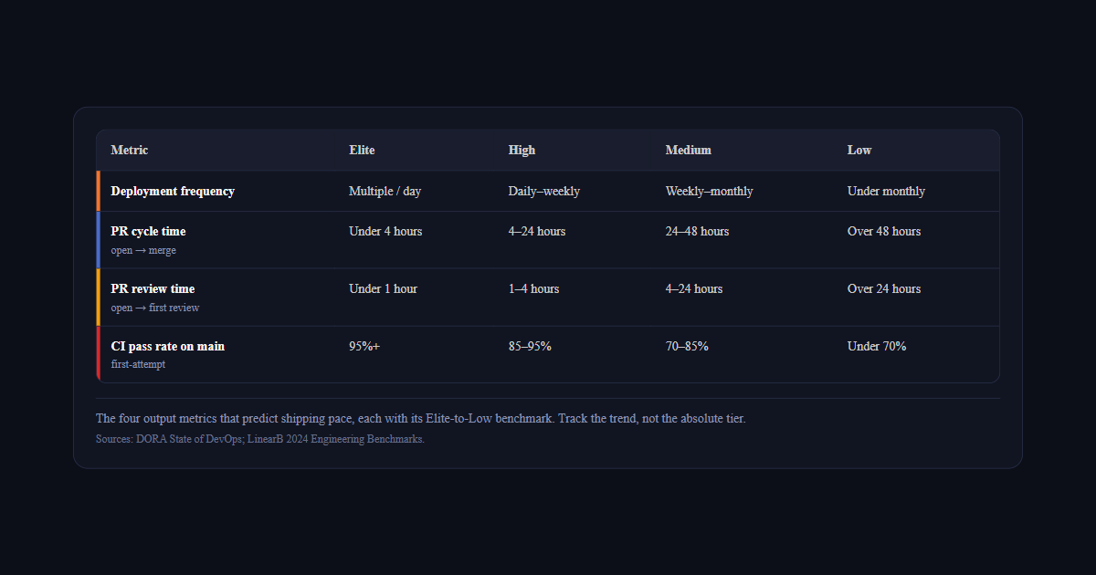
| Metric | Elite | High | Medium | Low |
|---|---|---|---|---|
| Deployment frequency | Multiple / day | Daily–weekly | Weekly–monthly | Under monthly |
| PR cycle timeopen → merge | Under 4 hours | 4–24 hours | 24–48 hours | Over 48 hours |
| PR review timeopen → first review | Under 1 hour | 1–4 hours | 4–24 hours | Over 24 hours |
| CI pass rate on mainfirst-attempt | 95%+ | 85–95% | 70–85% | Under 70% |
Track these weekly. Look at trends, not absolute values. A team moving from
"once per month" to "once per week" deployment frequency is improving,
even if they're not at "elite" yet. The weekly engineering health report format
is a practical way to track all four metrics together without building a custom dashboard.
And remember: these metrics measure output, not input. They're not gameable
by increasing estimates or under-promising. They measure what actually happened,
and that's what matters. Deviera's Value Dashboard tracks
all four automatically — deployment frequency, PR cycle time, CI pass rate, and
MTTR — updated in real time from your connected GitHub, GitLab, and Vercel integrations.
Want to see where your team stands right now? Use our free calculators to
benchmark your numbers against DORA tiers instantly — no signup required:
- PR Cycle Time Calculator — enter your review lag and merge time, get your performance tier. If you use Deviera, the live PR Cycle Time dashboard computes this automatically from your real GitHub events — no manual input.
- CI Health Score Calculator — score your pipeline on speed, reliability, and recovery
- DORA Metrics Calculator — benchmark all four DORA metrics and see which tier your team is in
How to track engineering velocity metrics automatically
Manually pulling GitHub API data into a spreadsheet every week works for one sprint.
By sprint four, nobody is doing it. Here's how the main tracking options compare.
GitHub Insights
GitHub's built-in Insights tab shows contribution graphs, PR throughput, and code
frequency at the repository level. It gives you a rough picture of activity but
no calculated metrics — no cycle time, no pass rate, no MTTR. It's also
repository-scoped: if your team works across 5 repositories, you have 5 separate
Insights pages with no aggregate view. Useful as a sanity check, not as a
primary velocity tracking system.
LinearB
LinearB is purpose-built for engineering velocity metrics. It connects to GitHub
and GitLab and calculates PR cycle time, deployment frequency, and review metrics
per engineer, per team, and per repository — with historical trend charts and
DORA tier classifications. It's the most complete retrospective reporting tool in
this category. Where it is lighter: real-time alerting when metrics breach thresholds,
and automated action (ticket creation, Slack alerts) when velocity drops.
Swarmia
Swarmia tracks velocity metrics with a developer experience lens — highlighting
focus time, review load balance, and interrupt rates alongside cycle time data.
Strong for teams where the root cause of velocity problems is workload distribution
rather than CI health or deployment pipeline issues. Less focused on CI pass rate
and deployment frequency tracking specifically.
Deviera
Deviera is an engineering intelligence platform that
tracks all four velocity metrics continuously and takes action when they
degrade — automatically creating tickets when CI pass rate drops, alerting Slack
when PRs go stale past the review time threshold, and logging Vercel deployment
failures with structured context. The Friction Score
aggregates CI health, PR flow, and deployment stability into a single 0–100 metric.
The Value Dashboard shows
deployment frequency, PR cycle time, CI pass rate, and MTTR in one view.
The DORA Calculator lets
you benchmark your current numbers against the four performance tiers instantly.
How engineering leaders drive engineering velocity improvement
Measuring engineering velocity is only the first step. The harder work is improving it.
Engineering leaders who consistently raise their team's velocity tend to focus on the
same set of levers — and the data almost always points to the same root causes.
Reduce context switching
Context switching is one of the most underestimated velocity killers. Every time a developer
switches between a GitHub issue, a Slack thread, a Jira ticket, and a CI dashboard, they lose
5-15 minutes of deep work. For a 10-person team handling 20 context switches per developer per
day, that's 30-50 hours of lost productivity per week — more than one full engineer's output.
The fix isn't asking people to focus harder. It's consolidating signals: routing CI failures
directly to issue trackers, linking pull requests to tasks automatically, and surfacing
team performance data in one place instead of five.
Address technical debt before it compounds
Technical debt degrades engineering velocity gradually and invisibly. Flaky tests slow CI.
Undocumented code requires re-learning every time someone touches it. Deprecated dependencies
block upgrades. Engineering leaders who track technical debt as a first-class metric —
not just a backlog category — keep velocity from eroding quarter over quarter.
The signal to watch: if your CI pass rate and deployment frequency are stable but PR cycle
time is creeping up, technical debt accumulation is usually the cause. Problem solving
on individual PRs is taking longer because the codebase is harder to change safely.
Align metrics with business goals
Engineering velocity metrics are most useful when tied to business goals. Deployment frequency
maps to release cadence. PR cycle time maps to feature lead time. CI failure rate maps to
customer-facing reliability. When engineering leaders present these metrics in terms of
business outcomes — not just team performance numbers — they get the investment and
organizational support needed to actually improve them.
Measuring velocity without connecting it to business goals creates a reporting exercise.
Connecting it creates a feedback loop that engineering leaders, product managers, and
executives can all act on together.